Learning Analytics
Designing data-heavy dashboards to support decision-making in enterprise learning platforms.
Enterprise SaaS · Data Visualization · Decision Support · Accessibility
Context
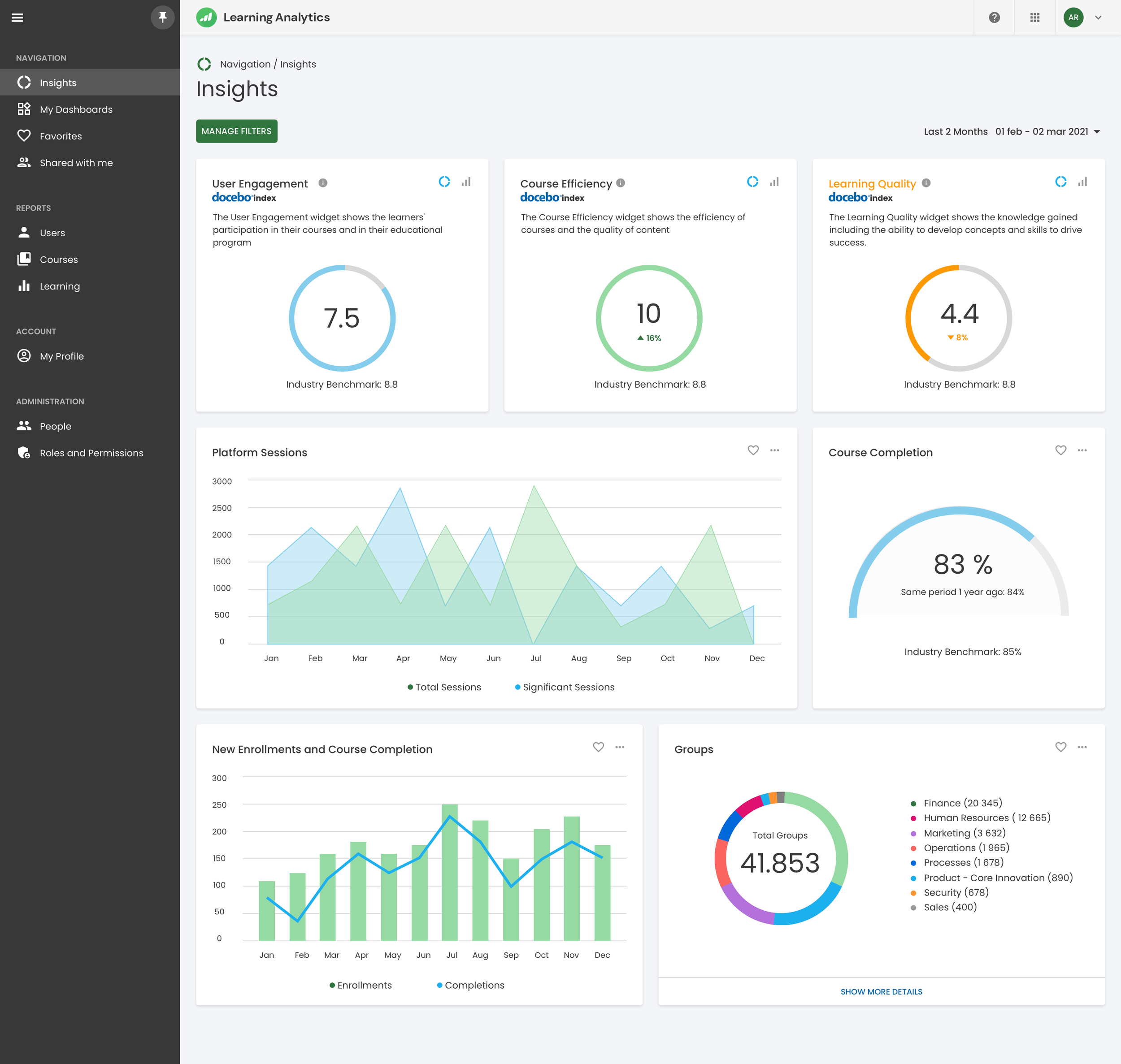
Learning Analytics is an analytics and reporting product within the Docebo ecosystem, designed to help enterprise organizations understand the effectiveness, adoption, and impact of their learning programs.
Organizations rely on learning data to evaluate program quality, benchmark performance across industries, and make informed decisions over time. However, accessing data is rarely the main issue — interpreting it confidently is.
The product is used by learning leaders, managers, and analysts who need clear signals rather than raw metrics to assess where their programs stand and what actions to take next.
The real problem
The main challenge was not data availability, but data comprehension.
Users had access to a large amount of metrics, reports, and filters, but struggled to:
understand what actually mattered
trust the data enough to act on it
move from insight to decision without external support
The risk was building a powerful analytics tool that looked complete, but felt overwhelming and unreliable in everyday workflows.
““The problem was not data, but confidence.””
Constrains & Reality
Before designing anything, there were clear constraints that shaped the work:
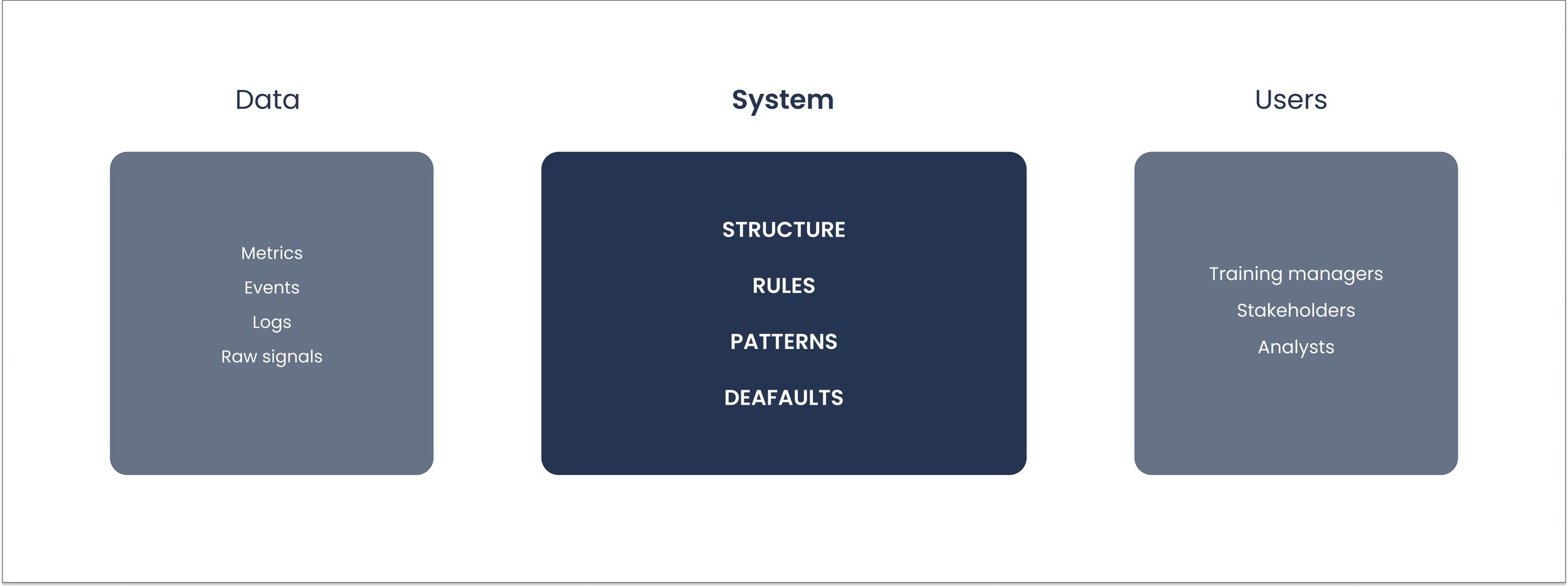
Large and heterogeneous datasets
Performance limitations on complex queries
Different levels of data literacy across users
The need to integrate seamlessly within an existing SaaS platform
Strong accessibility requirements (WCAG)
These constraints made it clear that the solution had to focus on structure and clarity, not on adding more data.
Competitive Landsscape
Before defining the design direction, we analyzed how similar analytics tools approached the same problems.
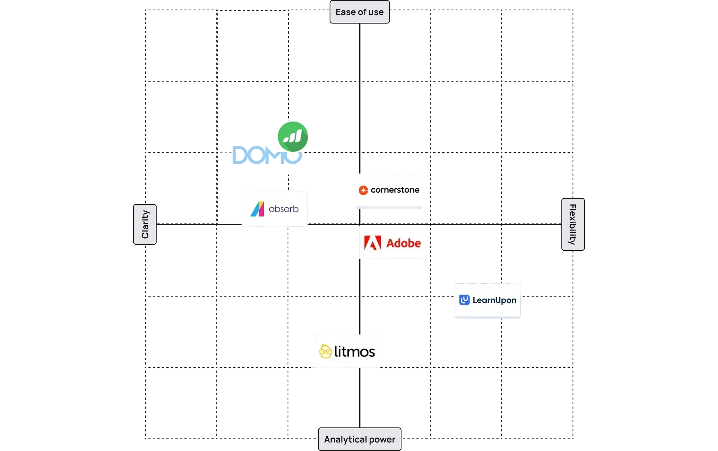
The analysis showed that most solutions favored either flexibility at the cost of clarity, or simplicity at the cost of depth.
This reinforced the decision to design around progressive disclosure.
Design Strategy
Instead of exposing all available data at once, the design focused on progressive clarity.
The guiding principles were:
Start simple
Progressive disclosure
Consistent patterns
Explain before optimise
This meant deliberately not showing everything, even when the data was available.
The hardest decisions were about what to leave out.
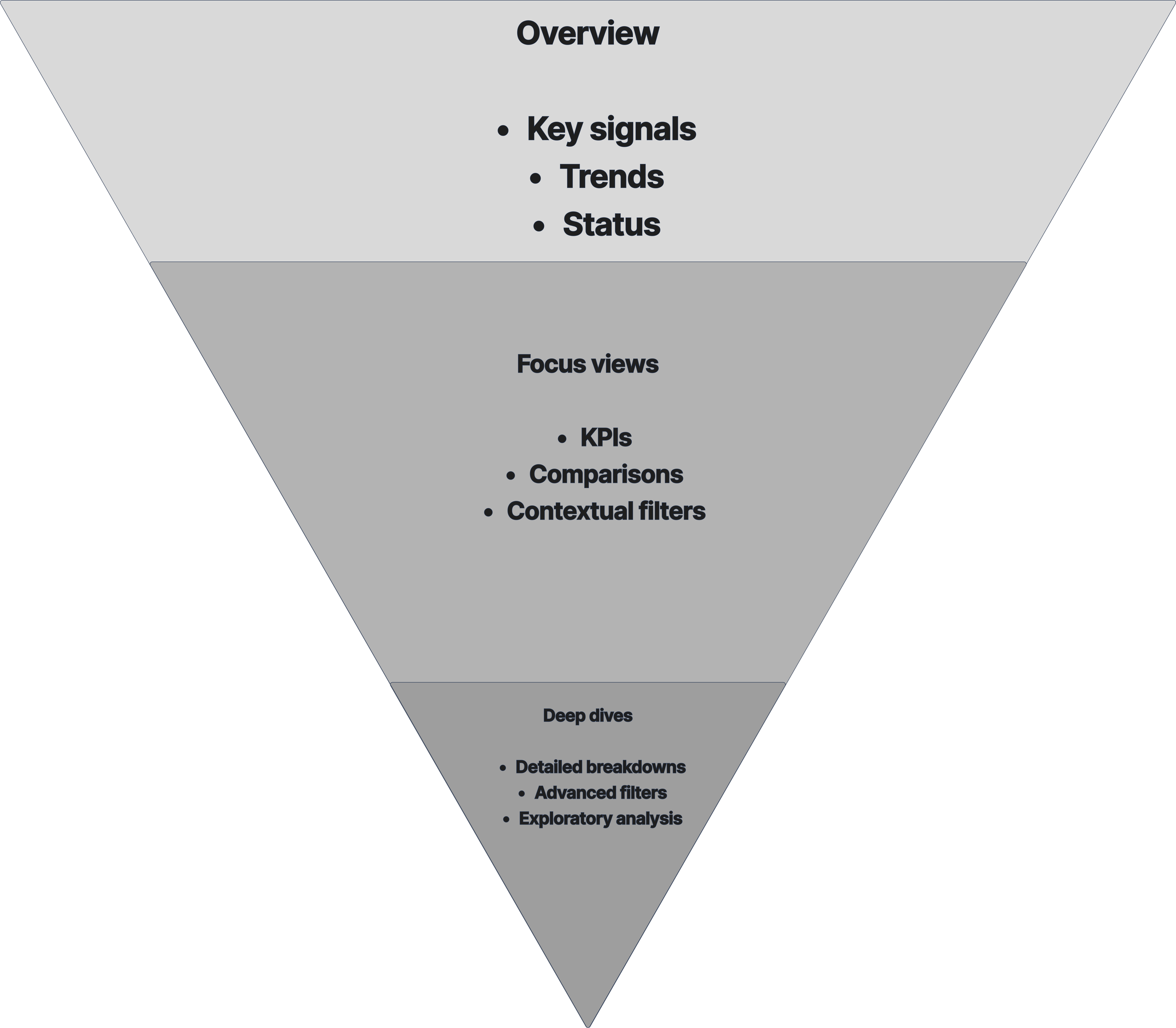
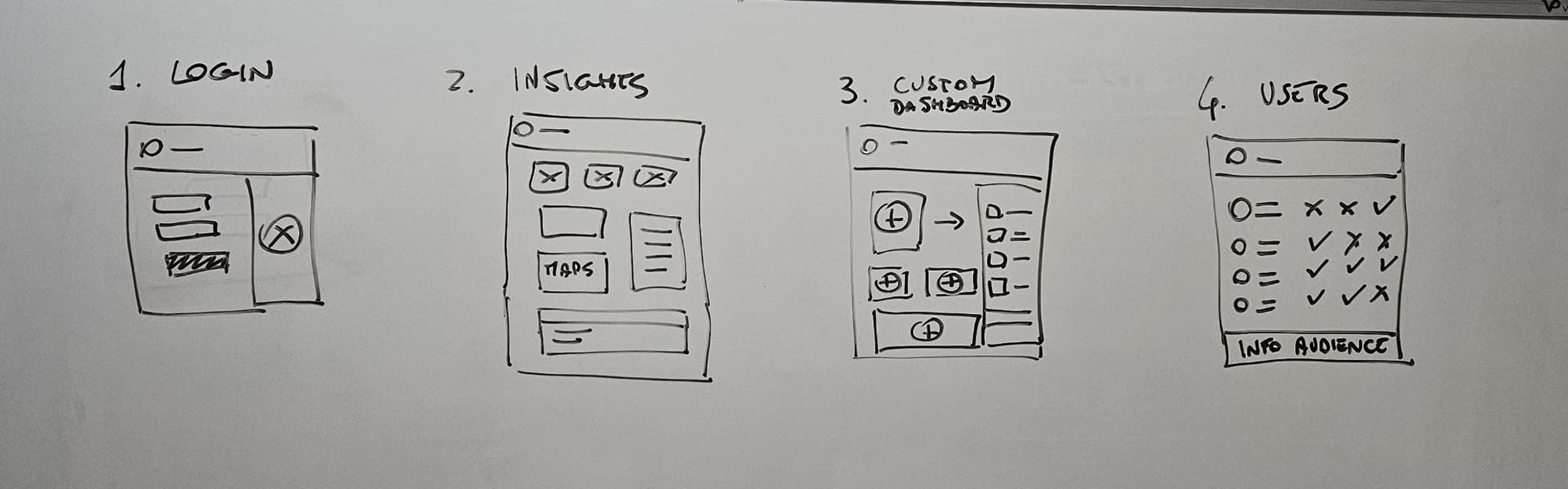
Information structure
The experience was redesigned around three levels of understanding:
Overview — high-level signals
Focus views — key KPIs and comparisons
Deep dives — detailed analysis
Each level had a different cognitive load and a clear purpose.
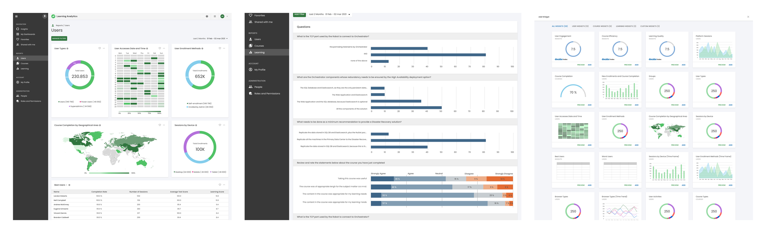
UI & Data visualization
Data visualization choices were driven by meaning, not aesthetics.
Charts selected based on comparison goals
Color used to signal change, not decoration
Interactions designed to reduce interpretation effort
Empty states treated as first-class scenarios
Accessibility was integrated from the start.
Design system
The product relied on a shared Design System maintained by a dedicated team.
My work focused on designing features that scaled within existing components and interaction rules, ensuring consistency without introducing fragmentation.
Outcome and Impact
The redesigned experience enabled users to understand data faster and make decisions with more confidence.
Internally, the work influenced analytics patterns across other products and strengthened shared design practices.